

Modals are a ubiquitous part of web and application development. They provide a way to alert or provide information to our users while maintaining simple UI. As long as we do not bombard users with too many modals (in this case it gets annoying and we don’t want that for our users) they absolutely should be embraced and well understood by your everyday developer.

So what will this part of the tutorial cover?
- How to get a basic project started
- Incorporate the state for our modal
- Build the UI for the modal using ReactJS
- Develop modal close behavior
Let’s begin!
Start a basic project
The first step to getting started is getting your project set up. We can use create-react-app to get our boilerplate locally, but for the sake of this example, I will be using sandbox. This way you will be able to jump right into the code I write. I learn through direct engagement and I find it inconvenient to have different learning-based projects stored on your local machine. Follow along to this example here. I will have one sandbox for each part of the learnings project.
Please note: if starting your own sample, sandbox will get you started with react-hooks, I converted mine to class-based component structuring to achieve better lifecycle method usage clarity for the sake of this teaching.
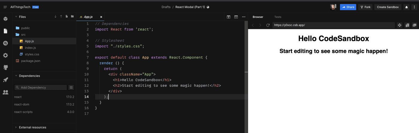
When you create your project on sandbox, you’ll see something like the following…
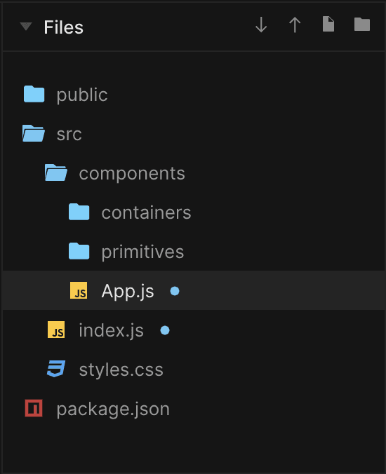
I want to edit the folder hierarchy to something that better resembles a properly organized app.
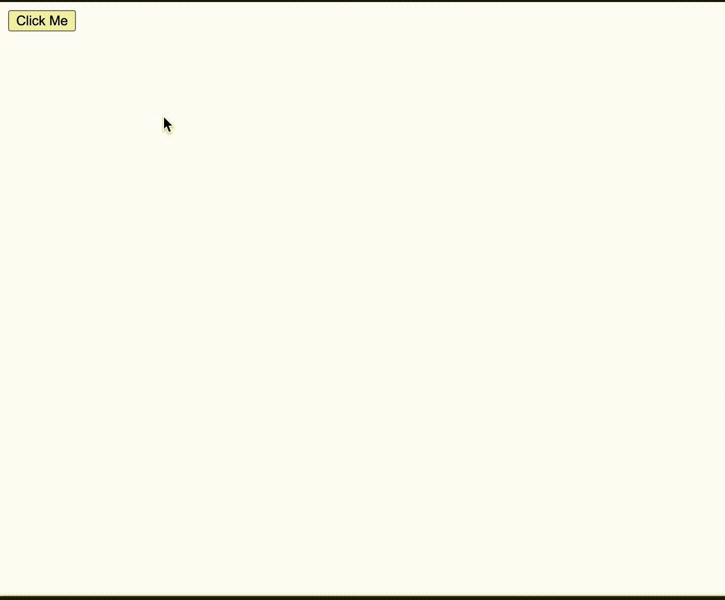
Now we get to the fun part! We start by getting a Modal to render. Let’s put a button on the page, and when the button is clicked we want a Modal to pop up and give us a hello!
Let’s edit App.js to add in our button.
// Dependenciesimport React from 'react';// Stylesheetimport "../styles.css";export default class App extends React.Component {onButtonClick = () => {console.log('ive been clicked!');}render () {return (<button onClick={this.onButtonClick}>Click Me</button>);}}
This is going to show our button on the screen. When clicked use the dev tools to see the console indicate our onClick handler is working.
Add state for our modal
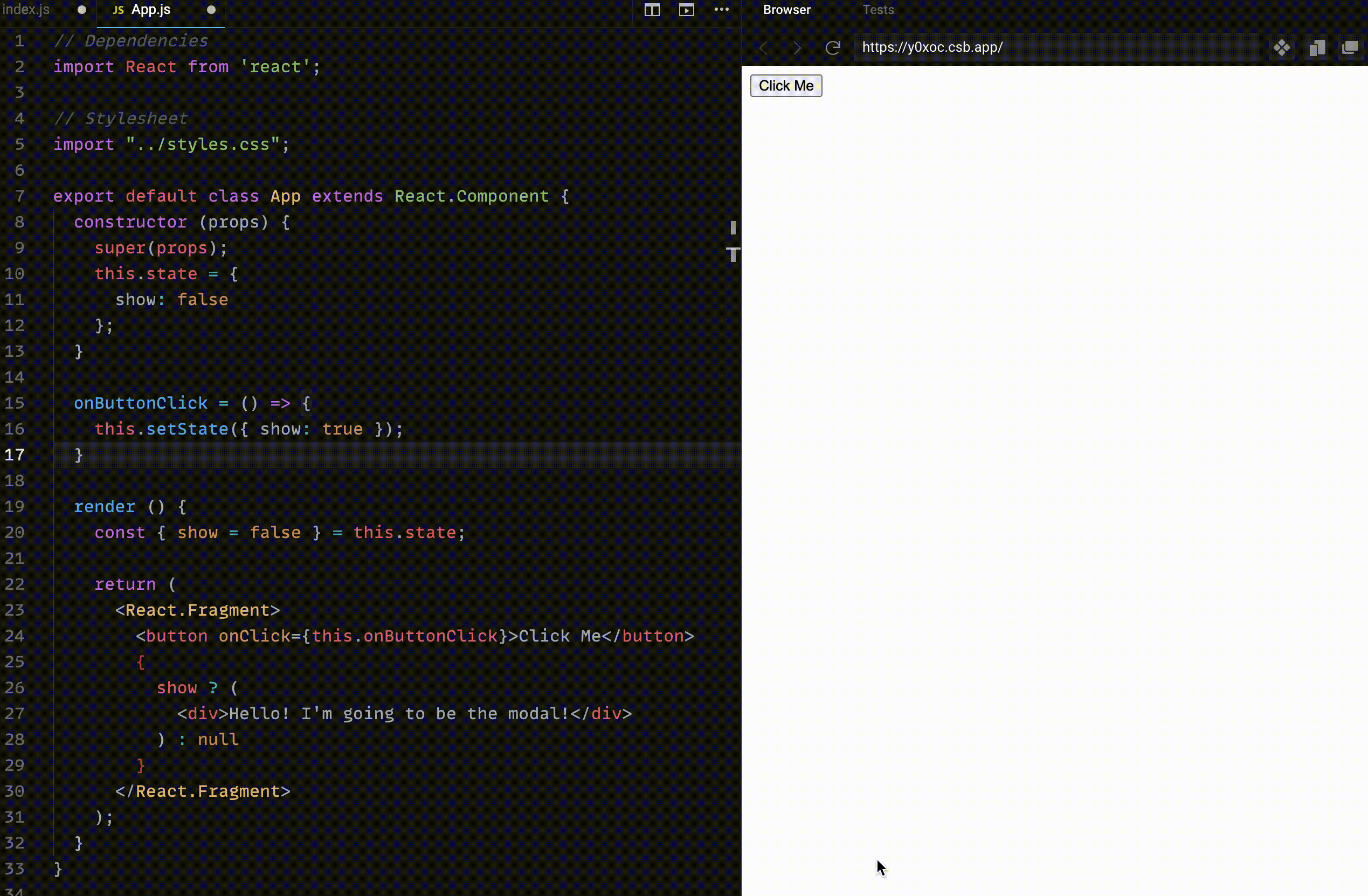
Now it’s time to make this button more sophisticated. We want to incorporate some statefulness to App, so our modal knows when to show or hide. We want the modal to show when the Click Me button is engaged with for the first time, and hide when the view outside the modal is clicked.
Let’s make some edits to progress towards this behavior. First, we introduce the show state and have our button click handler set the show state to true. When the show state is true, our “modal” which is just a div with some text, for now, should render.
// Dependenciesimport React from 'react';// Stylesheetimport "../styles.css";export default class App extends React.Component {constructor (props) {super(props);this.state = {show: false};}onButtonClick = () => {this.setState({ show: true });}render () {const { show = false } = this.state;return (<React.Fragment><button onClick={this.onButtonClick}>Click Me</button>{show ? (<div>Hello! I'm going to be the modal!</div>) : null}</React.Fragment>);}}
Build UI for our modal
Sweet! Looks like that's working. Now maybe we can work on our modal, it’s looking a little sorry. I will first isolate the modal to the path components/containers/Modal.js given our goal is to have the modal be reusable. The modal will take in show as a prop and have a condition to check if show is not true, to render null. This allows us to abstract things out and has our modal exclusively handle its rendering conditions.
// Dependenciesimport React from 'react';// Stylesheetimport '../../styles.css';export default class Modal extends React.PureComponent {render () {const { show = false } = this.props;if (!show) {return null;}return (<div className='outerModal centerFlex'>Hello! I'm going to be the modal!</div>);}}
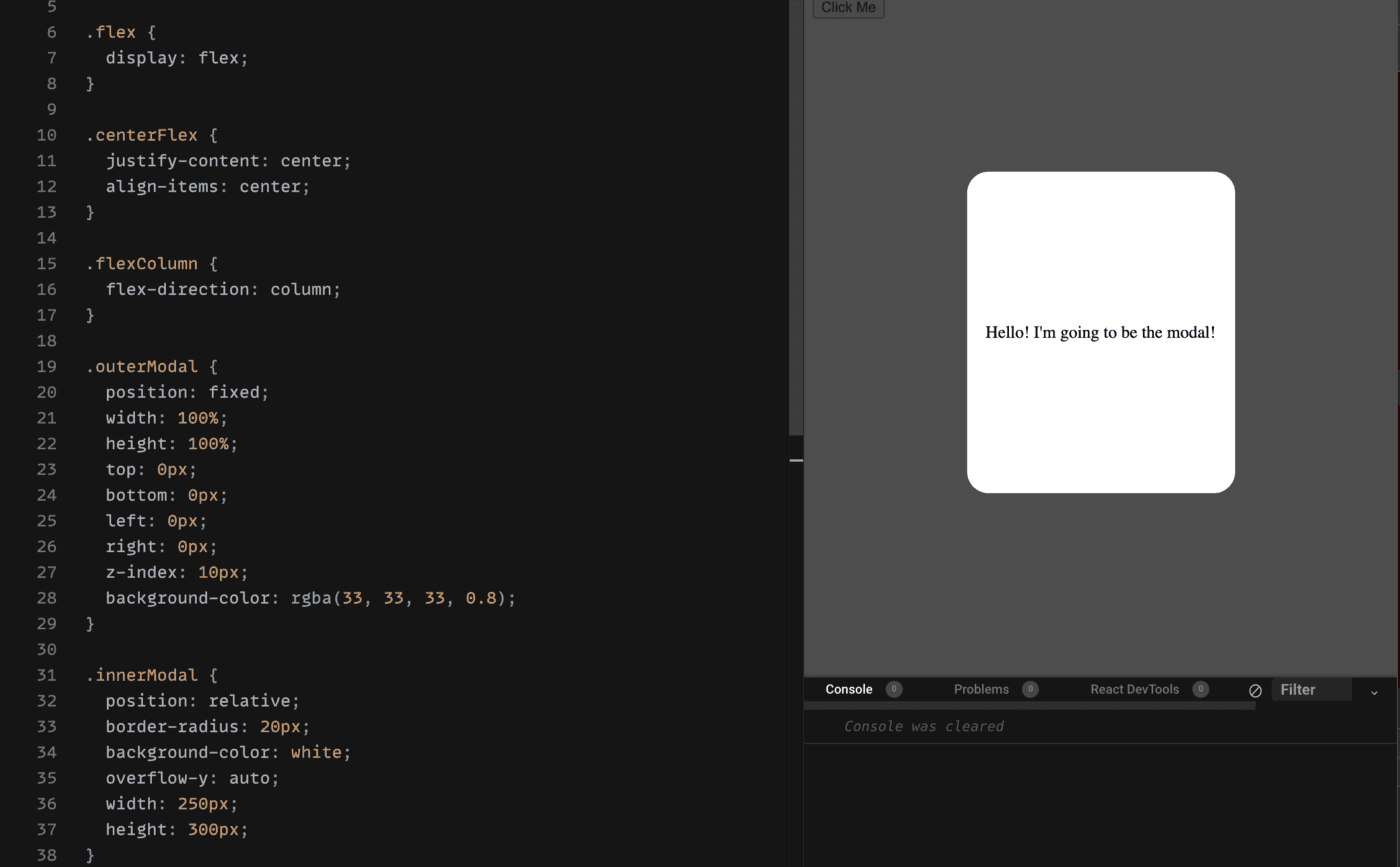
We also want to get the modal closer to how it’s supposed to look. We are aiming to get our modal centered on the page, have a white background, and overlay a gray background color to the outside view that we will make clickable to close the modal.
First, I will set up the outer div which will serve to be our gray clickable background, and center the children. I add a child div that will serve the purpose of rendering the content of the modal and include the background white styling we expect to see.
<div className='outerModal flex centerFlex'><div className='innerModal flex centerFlex flexColumn'>Hello! I'm going to be the modal!</div></div>
The styling involves a fixed positioning for our gray background color, we include a z-index so our overlay is the first most clickable element. Our inner modal is centered relative to the outer element, and we make sure that it's scrollable in the y-direction (in case our modal has a lot of inner content). I’ve attached a screenshot of the styling below. You can also see our modal at the right is starting to look how it’s supposed to!
Add modal close behavior
Next, we want the behavior we expect of our modal, as there is currently no way to close it. The way to accommodate this is to add an onClick handler to the outside div in our Modal component. That click handler triggers an onClose function which our modal’s parent component will provide as a prop. The parent (App.js) will then set the show state to false!
Putting this in practice, we will edit our Modal.js.
// Dependenciesimport React from 'react';// Stylesheetimport '../../styles.css';export default class Modal extends React.PureComponent {onOutsideClick = () => {const { onClose } = this.props;onClose && onClose();}render () {const { show = false } = this.props;if (!show) {return null;}return (<div className='outerModal flex centerFlex'onClick={this.onOutsideClick}><div className='innerModal flex centerFlex flexColumn'>Hello! I'm going to be the modal!</div></div>);}}
And then we will edit our App.js.
onModalClose = () => {this.setState({ show: false });}....render () {...return (<React.Fragment><button onClick={this.onButtonClick}>Click Me</button><Modal show={show} onClose={this.onModalClose} /></React.Fragment>);}
And now… drum roll, please!
We’ve got a modal that works!
There are just a few things left that we need to clean up. If you try clicking inside the modal you’ll notice it closes. We don’t want this behavior! The issue here is that the click event bubbles up from the inner modal div to the outer modal div then the click handler we added does its part to close the modal. To fix this, we use stopPropagation on our inner modal div.
<div className='innerModal flex centerFlex flexColumn'onClick={this.stopPropagation}>...</div>
And our handler in Modal.js
stopPropagation = (e) => {e && e.stopPropagation();}
Now our Modal won’t close when you click on its inner content.
We have one last detail to address before we conclude part one on Modals. I want to make one more abstraction before I’m satisfied. One detail we want to have for our Modal is flexibility with the inner content. Let’s work to leave it up to a parent component to define the contents of our modal. To enable the flexibility of having the parent specify the inner contents of our modal, we make use of the inherent children prop ReactJs passes to all elements for us. This method follows the Containment Composition strategy discussed in the ReactJS docs.
We now adjust our Modal container to make use of this strategy.
export default class Modal extends React.PureComponent {...render () {const { show = false, children } = this.props;return (<div className='outerModal flex centerFlex'onClick={this.onOutsideClick}><div className='innerModal flex centerFlex flexColumn'onClick={this.stopPropagation}>{ children }</div></div>);}}
App.js shouldn’t be the parent component to have the responsibility of providing the inner content of our modal, so we will define a more specific wrapper modal. For the sake of this example let’s call our specific modalGreetingsModal.js and it will live at the path components/primitives/GreetingsModal.js. GreetingsModal will leverage the now generic Modal and provide the relevant inner content.
// Dependenciesimport React from 'react';// Containersimport Modal from '../containers/Modal';// Stylesheetimport '../../styles.css';export default class GreetingsModal extends React.PureComponent {render () {const { show = false, onClose } = this.props;return (<Modal show={show} onClose={onClose}><span>Hello! I'm a modal!</span></Modal>);}}
We lastly need to tell App.js to use our new GreetingsModal instead of the generic Modal.
// Dependenciesimport React from 'react';// Componentsimport GreetingsModal from './primitives/GreetingsModal';// Stylesheetimport "../styles.css";export default class App extends React.Component {...render () {...return (<React.Fragment><button onClick={this.onButtonClick}>Click Me</button><GreetingsModalshow={show}onClose={this.onModalClose}/></React.Fragment>);}}
Nothing else has to change in App.js, we pass the same props we did before and handle everything else the same way. We can have GreetingsModal manage the state of our modal arguably as well. However, there are benefits to being aware of this type of state at a higher level. As our project gets more complex we might have additional logic dependent on this state. We might even leverage another library like Redux to containerize our state for us.
For your reference here is the sandbox of part one of this modal project.
This concludes part one of my Modal development teachings using ReactJS! Stay tuned for my upcoming writings that will continue iteration on this Modal, until we turn it into an advanced component that is reusable and applicable in the professional tech industry. Feel free to reach out to me as well with any questions, I am happy to help in any way I can!
Remember, developers are creatures that turn coffee into code. So I'd very much appreciate if you bought me a coffee!  I’m a new writer and I will be posting very frequently on my findings and learnings in the tech industry and beyond. Join my newsletter if you would like to stay tuned!
Thanks for reading again! ❤️
| Understand Open Graph Dynamic Image Meta Tags | 1 |
| Pros and Cons of Caching Data in Software | 2 |
| Email automation with Firebase Mail Extension and SendGrid | 3 |